Portfolio

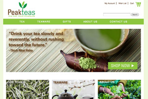
peak teas thumbnail

Peak Teas

eCommerce (Protosite)

This is a conceptual case study for an eCommerce website and developed for a fictional small business by utilizing the elements of user experience. Consideration was given to brand identity, the business goals and success metrics to indicate how to effectively meet the user's goals. The site was hand-coded using HTML5 and CSS3.

The workflow process included determining site objectives, user needs, functional specifications, content inventory, information architecture, interaction design, wireframes, branding, logo design, visual designs, resulting in a final protosite that would include a shopping cart.

Tools: Illustrator | Photoshop | AptanaStudio

Case Study (PDF) >

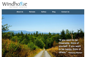
windhorse retreat thumbnail

Windhorse Retreat Center

Responsive Website - Redesign

The purpose of this project was to redesign the existing site, making it fully responsive for mobile, while focusing on site structure, page layout, navigation, color theory, typography and clean coding practices. The site was hand-coded using HTML5, CSS3 and PHP.

The website development included determining the information architecture, creating wireframes, visual designs, page templates and then the final protosite. Consideration to both the client's and user's needs were implemented throughout the development process.

Tools: Illustrator | Photoshop | TextWrangler | FileZilla

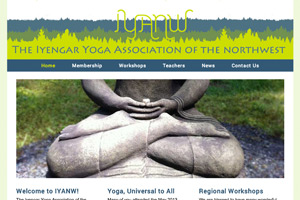
iyanw thumbnail

IYANW

WordPress Website

I built a custom WordPress website to replace the existing WP site. First I had to install and configure the site. Then create template pages and posts, adding plugins and widgets. This required an understanding of template tags and template hierarchy and I had to research the WordPress API to learn more about the process.

The process required using PHP and MySQL to create custom menus, dynamic sidebars, custom links and secondary menus, as well as blog/news posts. One advantage of a Content Management System (CMS) is it allows ease of maintenance for the client.

Tools: WordPress | Illustrator | Photoshop | Dreamweaver

zeeks pizza logo

Zeeks Pizza

User Research Methods

This case study is evaluating a website redesign for Zeeks Pizza using different design and user research methods to improve the design and the user experience for end users. Methods include website competitive analyses, design best practices (“heuristic”) reviews, card sorting, paper prototyping, and usability testing.

This is a current school project for a User Research Methods class and I am in the process of using the collected data from the Comparative Testing Report, where I performed randomized testing on two designs and creating a merged design. I will use that for my last usability test for the "Build and Integrate" stage of the UCD process. I've included a link to the Comparative Testing Report below.

Tools: Illustrator | Photoshop | Google Docs

Comparative Testing Report (PDF) >

donna's barber shop home page

Donna's Barber Shop

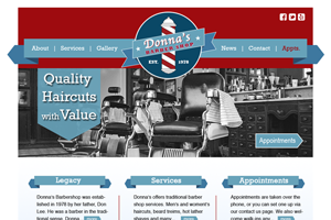
Website Visual Design

Don’s Daughter Donna’s Barber Shop is an established barber shop located in the Uptown neighborhood of Seattle. The owner, Donna wanted to establish her identity/branding as a community-centered traditional barber shop for her first website.

I created visual design layouts for the Home, About Us and Services pages. The concept was to create the look and feel of a vintage barber shop. I used the ribbon icon, black and white imagery and classic barber shop colors for consistency and branding, which brought a cohesiveness to the site.

Tools: Photoshop | Illustrator

peak teas logo thumbnail

Peak Teas

Logo Design

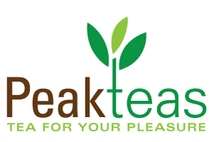
This logo design was part of a case study for a tea company that specializes in top-grade organic loose leaf teas. The logo was to target users that are the tea enthusiast, as well as those new to the tea drinking experience.

The typeface is Univers Condensed (bold & light). They compliment each other and the use of brown and green are key as they relate to "tea". I extended the lower case "t" in teas and added the leaves to represent a tea branch. I wrote the tagline "Tea for your Pleasure" as it sums up the branding strategy.

Tools: Illustrator

windhorse reatreat logo thumbnail

Windhorse Retreat Center

Logo Design

I designed this logo for a meditation retreat center on Whidbey Island, WA. The branding consideration for this client was based around its name "Windhorse", where the horse represents power and movement with grace.

I chose the typeface "Carolina Roman" because of its humanistic quality, as well as its characteristic rhythmic flow which gives the logo a light and elegant feel yet, using black provides a solid base. The blue horse icon gives a sense of wind and sky.

Tools: Illustrator

processs icons thumbnail

Web Workflow Icons

Process Icons

I created these icons for my portfolio process page. Each icon represents a stage in my workflow for web design/development projects. This helps to visually inform potential employers and clients of my process.

I divided the workflow into to three main stages, "Discovery", "Design", and "Develop". However, this process in not always linear. I included UX/UI processes since it's a major consideration in my workflow.

Tools: Illustrator

donna's barber shop logo thumbnail

Donna's Barber Shop

Logo Redesign

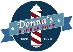
This is a logo redesign Don’s Daughter Donna’s Barber Shop. The owner, Donna wanted to establish her identity/branding as a community-centered traditional barber shop, while attracting new clients.

I used the typeface "Apple Chancery" for its feminine look, and "Rockwell Extra Bold" for contrast and because it is traditional. I chose variations on the classic barber shop colors. I incorporated the ribbon and barber shop pole also, for their vintage characteristics.

Tools: Illustrator

apicat logo thumbnail

APICAT

Logo Redesign

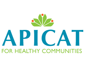
A logo redesign for the non-profit organization, APICAT - For Healthy Communities. Their focus is on healthy living and centered around smoking cessation.

Their clients are mostly Asian Pacific Islanders, so consideration was given to color symbolism. The blue and green colors evoke health and orange in the flower gives an uplifting quality. I decided to use the humanist sans-serif typeface Optima, because, it expresses warmth and confidence.

Tools: Illustrator